
|
|
|
| User Guide | |||||
The 1. menu component wrapping JSCookMenu
Name Type Required Default Description source Iterable <IJSCookMenuItem> yes The Java model for the menu items.
See alsotheme String no 'Panel' The name of the theme. This may be a user defined theme or one of the build-in themes Panel, Office, Office2003, MiniBlack, IE, SmartGreen.
See also:position String no 'vbr' Three letters.
- the menus orientation : 'v' vertical, 'h' horizontal
- submenu pop-up : 'b' button, 't' top
- submenu pop-up : 'r' right, 'l' left
value String no The name of the property to bind to the iterated IJSCookMenuItem-instance of the model.
See an example
From version 1.0 to 1.0.1 this parameter's direction changed from 'in' to 'out'.
See the release notes of version 1.0.1contentRenderer IMenuItemRenderer no Specifies an instance of IMenuItemRenderer. If the parameter is set, the component uses this instance for each of the items to get the component that renders the main field of the menu item.
See detailed descriptioniconRenderer IMenuItemRenderer no Same as contentRender but is used to render the icon field of the menu item.
See detailed descriptionprefix String no The prefix for the names of all those components, that render parts of the menu. If there is more than one menu on the page, this perameter should be set to distinguish the rendering components for the different menues.
See alsomainFolderLeft, mainFolderRight, folderLeft, folderRight, mainItemLeft, mainItemRight, itemLeft, ItemRight, subHSplit, mainHSplit, mainVSplit String no the corresponding property of the theme Overrides the corresponding property of the theme.
See alsomainSpacing, subSpacing, delay, clickOpen, effect, offsetVMainAdjust, offsetVMainAdjust, offsetSubAdjust int no The corresponding property of the theme Overrides the corresponding property of the theme.
See alsoincludeThemeCss boolean no true By default the component includes a link to the themes CSS sheet if the theme is found in the classpath.
There are two situations when this is not good:See also
- There is more than one menu on the page with the same theme.
Switch off this parameter for all menues except the first.- You want to change some of the css-styles:
Switch off this parameter and include the modified stylesheet by yourself.
The 2. menu component wrapping JSCookMenu
If your model is static, and your item captions are just text, this is your choice.
The model is given by an XML-asset.
See how to build an XML-model
In opposite to the above component, no contentRenderers are needed,
since both the item's link and its caption ae defined in the model.
The model supports DirectLink, GenericLink, ExternalLink, PageLink and ServiceLink.
Name Type Required Default Description xmlModel IAsset yes The XML-model for the menu items.
See alsolistener IActionListener no The listener method, that processes the directLinked items. The method must have the arguments (IRequestCycle cycle, String id) where the second argument is the id of the item, as given in the XML-model. displayModeProvider IDisplayModeProvider no If this parameter is provided, for each item the instance of IDisplayModeProvider is asked whether to show or to hide the item together with all it's sub items.
See alsoposition, prefix, mainFolderLeft, mainFolderRight, folderLeft, folderRight, mainItemLeft, mainItemRight, itemLeft, ItemRight, subHSplit, mainHSplit, mainVSplit, mainSpacing, subSpacing, delay, includeThemeCss, clickOpen, effect, offsetVMainAdjust, offsetVMainAdjust, offsetSubAdjust Same as in the JSCookMenu component
This component renders mouse-sensitive icons in the JSCookMenu.
It should be used only to render the icon fields of the menu items in case
that the default rendering has to be modified.
If you use it elsewhere, the mouse-over effect will not be visible.
See also:
What is the icon field?
How does the icon field render?
Name Type Required Default Description url String One of the two parameters must be bound The url/asset of the mouse-out icon.
The bound values may be null. In this case there is no icon shown.
If both parameters are bound, the following rules hold
Both null : No icon is shown
one of them != null : Ok, take it to render the icon
both != null : The url parameter makes the iconasset IAsset hoverUrl String no The url/asset of the mouse-over icon.
In contrast to the mouse-out icon, none of the two parameters must be bound.
The bound values may be null. In this case there is no mouse over icon shown.
If both parameters are bound, the same rules as for the mouse-out icon holdhoverAsset IAsset
To build a menu with the JSCookMenu component, you need
Alternatively, you can build a menu with the easier to use XML based XmlJSCookMenu component
The XML-model version
The Java-model version
The model is a collection of the items of the main menu.
It must be an instance of
Iterable<IJSCookMenuItem>.
Each item defines its icons and its submenu and if it is a separator or not.
For more information have a look at the JavaDoc of
the
IJSCookMenuItem interface.
The Java menu model is bound to the menu component via the source parameter.
With the class
BasicJSCookMenuItem
there is given a convenience implementation of
IJSCookMenuItem.
It adds a field value that can be used to carry data and might be bound via ognl.
Example of a simple model
Iterable<IJSCookMenuItem> model = new ArrayList<IJSCookMenuItem>();
|
Each displayed menu item has three fields
|
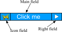 |
The right field is rendered by the theme so it can't be rendered individually for each item.
But both the icon field and the main content field can be rendered
individually.
Arbitrary tapestry components can be used to render them.
There are two ways to render the main content field. For the main field there is no default rendering. If none of the two ways is specified, an exception will be thrown.
If you want to show or hide some items dynamically without changing the model, the latter way is your choice.
Put a tapestry component somewhere on the page with the name
'<prefix>contentRenderer'. It will render all main fields of all items.
<prefix>
is the optional prefix parameter of the JSCookMenu component.
Example
<html>
|
The above example uses a DirectLink component to render all of the items.
Since the 'prefix ' parameter of the menu component is not set, the jwcid of the rendering component
is just contentRenderer.
If there is more than one menue on a page it will be necesary to set
the 'prefix ' parameter of the menues to distinguish its respective rendering components.
In the example the property menuItem is bound to the item that is visited by the iterator that
walks through the whole model. So menuItem can be used within ognl expressions to make
some item-individual rendering. In the example the value field of the
BasicJSCookMenuItem
instance of the model is retrieved via ognl to render the link and the action parameter.
Imagine you want to render some items with a CheckBox.
Others shall be rendered with an ExternalLink and the remaining
ones with a DirectLink.
Some Items might even not be rendered at all together with their submenues
depending on some dynamical state.
With the exception of the dynamical hidden items,
all this could be accomplished with some nested components and a lot of conditions
within the single component with the name '<prefix>contentRenderer'.
But this is a very poor solution because there is a lot of binding, nesting and conditional
rendering.
Arbitrary HTML-templates made by some designer can hardly be adapted to that structure.
Besides, dynamically hiding of some items is not possible at all!
A far better choice is to use an instance of
IMenuItemRenderer
.
That instance is bound to the menu component via the
contentRenderer parameter.
It's one and only method
render(IJSCookMenuItem) is called by the component
to retrieve the org.apache.tapestry.IComponent
that shall render the given item.
So, the relationship of the IMenuItemRenderer and the JSCookMenu component
is comparable to a TableCellRenderer and swing JTable.
To hide items dynamically (together with its submenu), just return null from the render method for the current item.
When you hide some items dynamically, dont worry about some separators
moving to the upper or lower border or moving together in consequence of the missing items.
The component takes care that there are neither sequences of more than one separator nor
separators at the begin or at the end of some menu.
|
Example
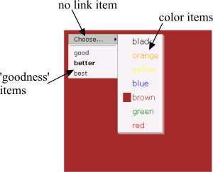
Create a menu that lets you choose the background color and a 'goodness' value.
It makes use of three differently renderered item types:
color items, 'goodness' items and a non-linked item to open the color- choosing
submenu.
The selected color is the page's background color and a square of that color is rendered in its corresponding color item (in the screenshot 'brown' is selected) The selected 'goodness' is marked with bold text in the corresponding 'goodness' item (in the screenshot 'better' is selected). See : the Java Code |
|
In addition to the two methods of specifying the main field rendering component(s),
which can be applied equivalently for the icon field,
there is a simple default icon rendering as well.
So, there are three methods to do the rendering of the icon field:
The same procedure as for the main field.
The name of the component is
'<prefix>iconRenderer'. <prefix> is the
'prefix' parameter of the component.
Also see the description of JSCookMenuIcon
Same procedure as described in the equivalent section for the main field. The parameter to bind the IMenuItemRenderer is iconRenderer
The return value null of the render method is handled differently for the
rendering of the icon field and the main field.
While a null return value in the latter hides the whole item,
a null return value for the icon rendering means to apply the default rendering
for the current item.
(see next paragraph)
In fact, the two above ways are a kind of exotic situation.
In most cases, the icons are just icons with mouse-over changing and for these cases,
there is a comfortable rendering method:
So, if none of the two above methods are used (i.e. no component with the name
<prefix>iconRenderer, no parameter iconRenderer is bound or
iconRenderer just returns null for the current item),
the component uses the default icon rendering.
The latter just renders the two assets (normal and mouse-over)
being provided by the
IJSCookMenuItem interface.
(null means: there is no icon).
There are many cases when the default behaviour can not be used.
This may happen when there are some dynamic urls, so that no
assets are available or if the icon urls are generated dynamically
by Hivemind-services or the like.
Sometimes you might also want to use the default rendering
for some icons but others shall be rendered differently. So
you might want to bind a IMenuItemRenderer
and use the default behaviour only as one of the many renderings.
For all those cases, there is the
JSCookMenuIcon
helper component in the library.
It renders mouse-over sensitive icons.
Mouse-over means the whole item not only the icon field.
See the component's
parameters of how to
set the icon urls or assets.
JSCookMenu creates action-links for the items. This means that the link will be invoked if the user clicks somewhere on the item's area even outside the item's caption or on the icon.
So, if your contentRenderer provides some <div>, <span> or <table>-tag with nested <a>-tags for some given item, there will not be any item-wide action-link generated. But of course each link will work as usual.
There are 6 themes bundled with the software:
Name Author Panel Heng Yuan Office Heng Yuan Office2003 Heng Yuan MiniBlack Heng Yuan IE Heng Yuan SmartGreen Burkhard Eggers
To specify one of the themes for your menu, just set the theme-parameter
of the component. All resources will automatically be included in
the page.
However, in most cases when a menu is included into a page, none of the 6 themes
will match the pages style. So what to do?
You can
Each of the 6 themes bundled with the software (and each new theme as well)
must have a unique name (see the above table).
In order to retrieve the resources for a given theme, the component
looks on the classpath for the following file structure:
| resource name | description |
|---|---|
| Theme<name>/theme.properties | Some integer values and HTML-snippets characterizing the theme. See the above detailed list. |
| Theme<name>/theme.css | The css-stylesheet |
| Theme<name>/*.* | The images referred to in the theme.properties or in the theme.css file. |
A copy of the theme files can be found in the docs/res folder of the distribution.
The following properties are defined in the themes theme.properties file.
| property name | description |
|---|---|
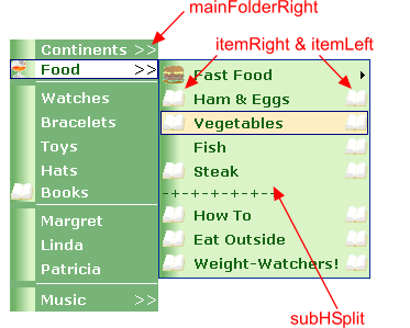
| mainFolderLeft | HTML snippet, that is put into the left part of a folder* item of the main** menu. |
| mainFolderRight | HTML snippet, that is put on the right side of a folder*
item of the main** menu.
This is often an arrow to indicate hat there is a submenu to open. If the menue orientation is horizontal, you will typically override this property with whitespace or with an arrow that points downwards. |
| folderLeft | HTML snippet, that is put on the left side of a folder* item of a sub menu**. |
| folderRight | HTML snippet, that is put on the right side of a folder* item of a sub menu**. |
| mainItemRight | HTML snippet, that is put on the right side of a non-folder* item of the main** menu. |
| mainItemLeft | HTML snippet, that is put on the left side of a non-folder* item of the main** menu. |
| itemRight | HTML snippet, that is put on the right side of a non-folder* item of a sub menu**. |
| itemLeft | HTML snippet, that is put on the left side of a non-folder* item of a sub menu**. |
| mainVSplit | HTML snippet, used for the menu splitter of the main menu with horizontal
orientation.
The 'V' stands for the vertical splitter. Typically this is just '|' |
| mainHSplit | HTML snippet, used for the menu splitter of the main menu with vertical
orientation
Note that this snippet is inserted in a <tr></tr> tag of a table that contains three columns. See the theme.properties files! |
| subHSplit | HTML snippet, used for the menu splitter of a sub** menu
Note the same as for the above property. |
| mainSpacing | Integer cell spacing value of the table that renders the main menu** items |
| subSpacing | Integer cell spacing value of the table that renders the sub menu** items |
| delay | integer delay time in milli seconds for the submenues to hide after mouse out |
| clickOpen |
how to open submenues
|
| effect |
special effects of JSCookMenu 2.0
possible values can be CMSlidingEffect (8) or CMFadingEffect (30, 80) See also the technical documentation JSCookMenu and Special Effects |
| offsetVMainAdjust, offsetVMainAdjust, offsetSubAdjust |
additional offset for vertical main, horizontal main and sub menues.
format [offsetX, offsetY] |
| * | a folder item is an item with a submenu (i.e. that has non-hidden children |
| ** |
main menu means the main part of the menu that is always visible.
sub menu are the pop up menues. |
If you want to change CSS-styles or create new themes, it is helpful to know
the generated HTML-code of the menues and to know which CSS-styles are applied.
See the generated HTML for
For other themes than 'Panel' substitute 'Panel' by the theme name in the above snippets.
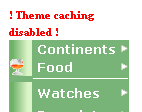
While working on a theme's stylesheet, it is very helpful, to switch off theme-caching.
Doing so, you can change the stylesheet and see the results with the browser's reload button.
Add the following line to your application specification:
<meta key="net.sourceforge.tapestry_jsmenu.cache-themes" value="false" />
|
If theme caching is disabled, there will be a considerable loss of performance. To make sure theme-caching be disabled only while you are working on a stylesheet, there is a warning marker displayed in each menu, when caching is disabled |
|
In order to create a new theme:
Just use the WYSIWYG-Gui tool
or..
Use one of the build-in themes or another theme that is on the classpath and override some of it's style:
Example
Take the QuickStart example from the overview site
and override some of the properties.
(the .page and .java files keep the same as in the QuickStart example)
<span jwcid="@menu:JSCookMenu" source="ognl:menuModel"
|
Screenshot (compare to the original example
without overriding)
The overridden properties are marked red,
In addition to the overriding, the
prefix is set to 'ex2'.
So all rendering components
start with 'ex2'.
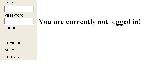
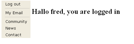
Since version 1.0, forms can be shown in the menu.
Example
Build a menu that shows
a login form for users that are currently not logged in.
For logged in users show a log out item and an email item with a sub menu.
Some more items are shown independently of log-in status.
See the Java code,
the HTML template,
To use the XML-model version, use the XmlJSCookMenu component instead of the JSCookMenu.
The menue's XML
Screenshot
See the Java code: XmlExample.java The page specification defines only the asset of the XML-model ressource. XmlExample.page The template XmlExample.html is very easy: Only, the theme, listener and XML-Model is specified. Finally, there are three Tapestry localization files: XmlExamples.properties, XmlExamples_de.properties and XmlExamples_es.properties, defining the message key i18n-m1, hat is used in the example in english, german and spanish respectively.
<?xml version="1.0" encoding="UTF-8"?>

<!DOCTYPE menu PUBLIC "-//sf//tapestry-jsmenu//MenuStructure//EN"

  "http://tapestry-jsmenu.sourceforge.net/dtds/menuitems.dtd">

<menu>

  <item value="I am a DirectLink" id="item 1">

    <directLink/>

  </item>

  <item value="Submenu" id="noLink">

    <item value="Subitem with Icon" id="sub1" icon="context:/images/quickstart/book.gif">

      <directLink/>

    </item>

    <item value="Mouseover Icon" id="sub2" hoverIcon="context:/images/quickstart/fastfood.gif">

      <directLink/>

    </item>

  </item>

  <item value="PageLink to Quickstart" id="pagelink1">

      <pageLink page="quickstart/QuickStart"/>

  </item>

  <separator/>

  <item value="Item with icon" id="item 3" icon="context:/images/quickstart/fish.gif">

    <directLink/>

  </item>

  <item value="Mouseover Icon" id="sub2" hoverIcon="context:/images/quickstart/world.gif">

    <directLink/>

  </item>

  <separator/>

  <item value="GenericLink to SourceForge" id="gen1">

    <genericLink href="http://www.sourceforge.net"/>

  </item>

  <item value="This is an ExternalLink" id="ext1">

    <externalLink page="xml/XmlExample"/>

  </item>

  <item value="message:i18n-m1" id="i18n">

    <directLink />

  </item>

  <item value="Target 'top'" id="top">

    <directLink target="top"/>

  </item>

  <item value="scheme : https" id="https">

    <directLink scheme="https"/>

  </item>


</menu>
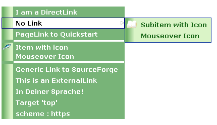
You can internationalize the captions. For this aim, use the 'message:'-syntax in the 'value' attribute of the item:
The messages are looked for in the namespace of the current page (includes application-wide messages as well).
As illustrated in the above example, you can specify two icons for each item: The normal one and a mouseover icon. The icons can be retrieved from the classpath or from the context. Use the respective syntax 'classpath:/...' or 'context:/..'.
If you want to use localized icons, reference them from the classpath. The 'context:/' syntax doesn't work with localized icons
The XML model is static. However it is possible to hide items dynamically.
To this aim, set an instance of
IDisplayModeProvider to the
displayModeProvider parameter.
The only method of IDisplayModeProvider is
It is dynamically invoked for each item with its id and roles.
the latter are given as a comma separated list by the 'roles' attribute of the 'item' XML-tag
The item is shown if the method returns true.
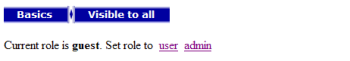
Screenshot 1
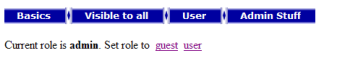
Screenshot 2
See the Java code:
RoleBasedHiding.javaThe template
RoleBasedHiding.htmlThe XML-model
menu.xml
<?xml version="1.0" encoding="UTF-8"?>
|
The XML is validated against the above DTD, the first time
the XML is loaded in the web-app.
From version 2.1 on, the dtd is no longer retrieved from the internet
but it is included in the package.
Previous versions retrieved the dtd from the internet.
So it is no longer necessary to provide local copies of the dtd
if your server has no internet connection.
Nevertheless, the above DOCTYPE must be included in the XML.
Furthermore it eases development, since
many XML-editing tools use the dtd-reference to produce code completion.